Showing posts with label artwork. Show all posts

Sunday 12 April 2015

Blood Beast...

So, after a bit of a break, I'm back. This time around it's with an idea for a 1E D&D monster inspired by a not very good movie. That movie is Night of the Blood Beast, which is only particularly watchable via Mystery Science Theater 3000 and you can see it here. Or you can see the un-riffed version here.

Actually, I say that it's not a very good movie but that sells it short a bit. The overall premise is quite well done and there is a suggestion of an atmosphere to the scene it sets, but it's all just handled a bit poorly. As it's a film produced by Roger Corman, this is not really surprising but probably not entirely his fault.

I've watched it a fair few times in it's MST3K incarnation, and I've found myself liking the Blood Beast as a creature. It's not too different from creatures in later movies, such as the xenomorph from the various Alien films. And, at the end of the day, all are just blokes in suits waving their claws around but Corman and co. just had a lot less money. The way the creature goes about its nefarious purpose in Night of the Blood Beast has a bit more of an interesting angle, and I thought it might translate well to being a 1E D&D monster. I've also run up a quick drawing to go with the description:

BLOOD BEAST


FREQUENCY: Rare
NO. APPEARING: 1 
ARMOR CLASS: 4 
MOVE: 8" 
HIT DICE: 4 
% IN LAIR: 20%
TREASURE TYPE:  None 
NO. OF ATTACKS: 3
DAMAGE/ATTACK: 2-12 claws,1-8 bite
SPECIAL ATTACKS: Charm
SPECIAL DEFENSES: Nil
MAGIC RESISTANCE: 25%
INTELLIGENCE: High 
ALIGNMENT: Lawful Evil
SIZE: L (8') 
PSIONIC ABILITY: Nil 
      Attack/Defense Modes: Nil

The Blood Beast inhabits dark caves and similar underground places, and is particularly attracted to the presence of sentient beings. If it detects a party of adventurers, it will attempt to follow them and can Hide In Shadows and Move Silently as a fourth level thief. It will then carefully chose a time to make an attack on a single victim and attempt to drag them back to its lair.

In melee combat, the Blood Beast will attack with large claws and a bite. In order for its kind to propagate, it must use its bite to infect its victim with parasitic young. Anyone infected in this way will become host to 2-8 amorphous, amoeba-like creatures which will gestate for 2-12 days before eating their way out of their victim. This 'birth' will cause 1-8 damage per creature, and any that escape will grow into a fully formed Blood Beast in 2-8 days. Until that time, the infected person will seem normal and healthy.

The Blood Beast will also try to sow dischord and confusion amongst a party by the use of a powerful Charm spell, hoping to lure more victims. If a player has been dragged away and killed by the Blood Beast, it will use that player's voice as a Charm in order to call to his or her compatriots and so place them in a situation in which it can make another attack. Alternatively, it will use Charm on a victim it has bitten and release them back to their party. That player will then try to convince their compatriots that the Blood Beast is only acting in self-defence etc, and try to place them in a situation in which the monster can make another attack. In both cases, victims must save versus magic at -2.

Description: the Blood Beast is a large humanoid with a prominent eyes, a large beak-like mouth and long claws. It is covered with many folds of rough abrasive skin, some of which hangs from its body in ragged tatters. This skin is made up of many dark hues that allows it to blend well with its envionment. Its eyes are a deep blackish red.


Tuesday 8 April 2014

Artwork for The Lovecraft eZine...

Awhile back I had the chance to create some artwork for the latest issue of The Lovecraft eZine. The story that I was assigned to illustrate was 'The First Act', by Pete Rawlik.

After a few read-throughs, my initial ideas were skewed towards a film noir-like image, along the lines of the moodier work created by James Bingham. However, further read-throughs made me realise that an abstract piece of artwork would be needed, mostly because the story itself is a monologue where various imagery is suggested but not always defined; certain pictures are conjured up but details are kept more to a minimum. So, whilst I knew that someone was tied up and that there was the threat of a knife being used, the story didn't detail the whys and wherefores (i.e. were the characters in a room or a basement? Was someone tied to a table or chair?) and so I didn't want to suggest too much outside what the author had already implied.

That said, I did pick up on the idea of the knife, which in turn sparked off a few ideas about what could be the focus for the image. I liked the idea of being quite noirish with the lighting, and so took various backlit photos of my hand holding a knife:


I thought that it was also important to include some sort of visual reference to 'The King In Yellow', as this particular issue of the eZine features stories inspired by that book. I've always liked the artwork for original print of 'The King...', particularly the hardcover version and so wanted to show that in some form:


After various sketches, I settled on an idea that combined these various concepts:


The above piece shows the drawn image in the raw, just to show how things looked before the final image was put together. I wanted to have slightly organic lines radiating out from the central core of the image, and so broke these up into groups of smaller waves, all of which combined to make up a background inpsired by 'The King In Yellow' cover. The knife is chunkier and the hand is taking more of a concerted grip upon it, as the fingers are more tightly curled and suggest something a little more determined.

As I wanted to abstract things a little further, I composited the above drawing within a digital framework using some lines from Act 1, Scene 2 of 'The King In Yellow', which in themselves are oddly abstract:


You can see a larger version of this over at The Lovecraft eZine site. Hopefully it did the story some justice. The drawing itself was done with pen, water-soluable pencil and gouache wash on Bristol Board, the original being around 20 x 14 cm (8ish x 5 inches).

Monday 14 October 2013

Bestiary artwork

Over the summer I created 40 spot illustrations for the Adventures Dark and Deep Bestiary, a Kickstarter project for BRW Games. This has recently become available (via RPGNow), way ahead of schedule and looking very nice indeed!

The brief for the artwork was that it had to follow an old-school D&D line art vibe, and that the images couldn't be larger than 3.5 x 2.25 inches. This in itself was an interesting challenge, as I had to keep things relatively concise and uncrowded visually. The use of greyscale wash wasn't strictly allowed, so I had to make sure that my line work was steered in certain directions. 

Creating 40 illustrations wasn't planned from the outset. BRW's Joe Bloch would send five descriptions to me and the other artists, and we would get a new batch when those were done and signed off by him. I ended up creating 40 simply because I was inspired by the subject matter. I found that some images were much easier to create than others, as I had an idea and then had that flow from pencil to pen to paper. Others took two or more attempts to get right before I was happy to send them along to Joe.

I guess I could have made my life a little easier if I'd not tried to draw each one within the prescribed dimensions, as I could later scale them down digitally. However, that would have made for a variation in line width from image to image and skinny lines in such small illustrations could end up being somewhat illegible. I wanted to try and have the line scale stay consistent. I also tried to work with a few different drawing styles within my own general one, and then tailored that to suit the old-school vibe. Skimming between the Monster Manual and Field Folio (especially Russ Nicholson's work in the case of the latter) helped me to sqaure everything in my head as I was working.

Here are some sample thumbnails:

Clockwise: Blindheim, Titanic Spider, Shambling Mound, and Cave Fisher

Clockwise: Deadly Slime, Flumpf, Jinx Midge, and Mimic

In some images, I tried to tell a bit of a story. In others, I wanted to keep things simple and just show the creature itself. All in all, it was a very interesting project to work on!

Saturday 24 August 2013

Artwork for Gygax Magazine #2

A month or so ago, a chance note on the Old School Gamers Facebook group put me in touch with Jayson Elliot, editor-in-chief for Gygax Magazine. After a very interesting 90-minute chat with him on Skype, I volunteered to create a full-page illustration for an adventure that appears in issue #2. This is for The One Ring RPG, entitled 'The Hare and the Hill Giant', and is written by Shane Ivey

The plot for this interested me and a couple of ideas for a composition immediately sprang to my mind, primarily because trolls feature strongly in the plot. Here's a scribble of an initial idea:


However, I was cutting things a little fine. I had around 3 days to create the image and get it signed off, as the deadline was fast approaching. That's a rather quick turnaround time. Not only that, but the weather here in London decided to take a turn for the worse - at least, as far as creating artwork is concerned. Temperatures were around the 33 degrees C mark (that's just over 90 degrees F), which isn't at all good if you're working with gouache and ink in a room that has no air conditioning. I wanted to get back into working with pen and wash, although the conditions weren't ideal, but your brave author indomitably slaved away regardless...

Anyway, once I'd had a few tries at the overall composition, things started to fall into place. I'd also managed to work up two other sketches more fully with the goache/ink treatment. So here is the final full-page piece:


And here are the two spot illustrations:


Everything came out okay in the end, I'm happy to say. It was an interesting challenge, to say the least. I wanted to keep the main image fairly neutral. Rather than depict a combat scene - as it's not a given in the adventure - I chose instead to have a troll surveying his new-found residence as dusk closes in. I had a variety of options for my depictions of the creatures, and this came out in the smaller drawings.

Hopefully the weather will be better when I work on my next piece! Oh, and for the record, everything was done on Bristol Board using Pilot DR and Unipin pens, Windsor & Newton inks and gouache, and a Faber Castell water-soluable pencil.

Wednesday 29 May 2013

'Adventures Dark and Deep Bestiary' Kickstarter

This Kickstarter has just passed the mark for including illustrations for 300 monsters. There are only a few days to go before funding ends - more cash means more illustrations!

More info can be found here...

Monday 20 May 2013

Kickstarter for the 'Adventures Dark and Deep Bestiary'

This project will be 'A book of more than 900 monsters for the Adventures Dark and Deep game, but usable with many Old School RPG systems'. The Kickstarter has 12 days to go - the more funds it raises, the more artwork will be created for it. You can also sponsor one or more pieces of artwork.

I'll be one of the artists who will be illustrating the book. Should be fun!

More info can be found here...

Sunday 19 May 2013

Green Grabber rework...

Here are another couple of quick scribbles of a Green Grabber. I thought I'd redo the overall shape so that it's more like a bladderwort:


 I've also had a go at depicting the 'Sleepflower' stage of the plant:


I'm not sure that both designs still sit 100% right in my mind - the Sleepflower may be a tad too 'Little Shop of Horrors', perhaps. Anyway, it's always fun drawing Stirges!

Friday 10 May 2013

Women in armour (and some in uniforms)...


There's a rather good Tumblr feed called In Male Dress. It features many photos from a wide variety of re-enactment and other sources. Some of these feature women wearing different styles of armour.

At some point or another I'll get around to doing a sequel to my earlier post bemoaning the silliness that is the so-called 'breastplate' one sees far too often in RPG artwork. In the meantime, a glance over the images from this Tumblr feed should hopefully show that such things aren't required. If anything, photos from reality are way cooler...


Tuesday 22 January 2013

Demonagerie - the strange world of Medieval art

Fantasy RPGs can tend to draw on the Medieval period for influences, but at the same time miss out slightly on the sheer oddity of that period's worldview. Even Ars Magica seems to have skimmed past this, which is a shame. Instead, for the most part, we tend to get presented with the Conan-style fantasy angle which to my mind has never been a particularly good influence. Why? Well, I've never been completely sure that it's not been conflated with the horror that is the Renaissance Festival...


Is this because of a somewhat peculiar take on the Medieval period, combined with a vibe that owes more to Hollywood films than it does to an understanding of European history and culture? Hmm. Possibly.

However, should one want to tap into the actual period one would discover that it is full of odd imagery that wouldn't look too out of place in, say, a D&D setting. For example:


This picture comes from an excellent site called Demonagerie, over at Tumblr. There's lots of demons, dragons, monsters, knights and a variety of other images and symbolism that may help to inform or flesh out your fantasy campaign. Huzzah!

Saturday 5 January 2013

Something for your Paladin...


Over at the excellent Bibliofind blog you can see various interesting examples of heraldry from the Medieval period. These range from the quite simple (i.e. in the image above) to the more ornate. They could perhaps be a source of inspiration for your group's Paladin, or those of various other knightly persuasions. Bibliofind has also collected other examples - check the links at the end of the blog post.

Wednesday 19 December 2012

Taking breastplates too literally...


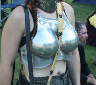
As I've said before, the way women are depicted in many fantasy RPGs is usually pretty poor. I was going to consider how this tends to revolve around the artists apparently being obsessed with showing cleavage no matter what, and that the depiction of women in armour was not immune from this. This was then going to segway into the impracticality of such designs - but someone has beaten me to it.

As that article points out, the type of armour shown in the above photo would cause problems to the wearer should she fall forwards. Even with a padded jack underneath, the amount of damage caused by blunt trauma wouldn't be at all pleasant. You also don't really want to have anything that acts as a handy channel for weapon strikes against vital organs. Traps and channels on armour, shield bosses and weapons are there to snag or interfere with the path of an attack in some way. Ideally that means that the attack is kept away from the vitals, limbs, etc. A similar principle occurs with another armoured thing - tanks. Certain parts of a tank can, if not designed correctly, act as 'shell traps' for incoming rounds. Sometimes this traps those rounds near vital areas, such as the drivers position. Not good.

The article makes note of female armour in Mass Effect 2, but I'd say that that's also barking up the wrong tree. First and foremost, it's pointlessly sexualised in a way that the man's armour is not. If the same thing was done with the man's armour - say, the inclusion of a large, protruding armoured codpiece - most people would say 'That looks ridiculous'. But for some reason this sort of silliness generally isn't pointed out when women's armour is sexualised. Secondly, it's not at all practical for someone who may need to lie prone when firing a weapon, take cover, crawl, etc (and the same rule would apply to the armoured codpiece). Take an illustration from modern body armour - here, for example. Note that there's no mention of women needing an armour that both seperates and supports. It just needs changing in a few key areas to better match the anatomical differences. The same factors would apply to women wearing armour in a fantasy RPG setting. 

What does this mean for an artist wishing to avoid the common cliches? Well, the simple fact of the matter is that there's pretty much little difference in the way that men and women look whilst wearing armour. This is especially so with plate armour, and if a full-face helmet is worn. However, that doesn't mean that there aren't subtle visual cues. If we consider the fact that, even in a fantasy RPG setting, men and women fighters would have had to have trained with their armour since an early age we could perhaps take our cues from modern imagery. One possible consideration could be male and female athletes from the same sports. There are similarities in their body shapes to a certain extent (depending on the sport), but there are also differences. At the end of the day this boils down to a couple of factors. One: an understanding of anatomy (hint: breasts aren't solid masses). Two: observation of how things can look in real life and drawing on that for inspiration. Three: developing an understanding of what's being observed (for example, how is the armour constructed? Is it part of a layered suit?). Whilst I might hesitate to say that many RPG artists lack such skills, it does seem that they are willfully abandoning them in order to follow a more hackneyed approach. That doesn't ultimately send out the right sort of signals, both about the outlook of the artist nor whatever RPG is using the artwork.

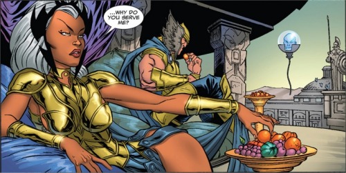
One other factor that seems to feed into this is the way women are portrayed in other fantasy art. I'd say the main culprit is comic art, of the super hero variety. Super heroines tend to wear 'boob socks', and it seems that the fashion has been translated into armour somewhere along the way. Maybe with a nod towards being slightly less silly, but silly nontheless.

But it's not all doom and gloom. We don't have to be stuck with chainmail bikinis and those breastcup cuirasses. There are depictions out there of women in armour that aren't rubbish. For example...

The above image is of Theresa Wendland, and comes from here
A nice example from LARPing...

Sourced from here
Some lamellar armour...

Sourced from here

Some more plate, this time worn by Virginia Hankins...

Sourced from here

And if you want something with more of an RPG flavour, there's this...

Sourced from here

And here's a more naturalistic pose (okay, it's not armour but there is a weapon involved)...

I wish I knew where this originally came from. I dug it out from Tumblr somewhere and haven't been able to find it via Tin Eye...

See? All pretty good! And not a chainmail bikini in sight. Okay, so perhaps some of the above are a little stylised. What if we consider how a woman might look when engaged in combat with a sword or other weapon? Here's one interesting video, featuring Theresa Wendland:


Their training weapons are a bit heavier than actual fighting versions, but you get the idea. Note the stances, attacks and parries used in the above clip - all apparently sourced from actual fighting treatises from the Medieval period. And a tad different from the sort of fighting stances one sees women posed into for RPGs. Here's something a little more florid, although equally of interest and featuring Virginia Hankins:

Hopefully all of the above demonstrates that we don't have to keep treading the well-worn Dreaded Path of Ye Olde Fantasy Clichés. Artists can chose not to go down it, and hopefully one day more of them will. Women don't have to be dressed up in silly 'armour' and costumes for RPG settings. It just takes a bit of time and effort, and less of a closeted mindview as to how women are depicted.

Friday 23 November 2012

Japan's ninjas heading for extinction

An interesting article appeared today on the BBC website about the demise of the ninja. It seems that once the last generation of actual ninjas dies there will be no more of them. I hope that there is going to be some sort of effort to set down information about what they did for the historical record.

I also imagine that, once this last generation has gone, the way ninjas are portrayed will probably get even sillier than has been the case over the years. As a subject, they've had a rough handling from film and TV - not to mention RPGs. Even basic ideas about what they look like have been disposed of, for various reasons. For example, this is what a ninja actually looks like:


And this is an example of how a modern RPG tries to do things:

The above image comes from a Gaming As Women article.
Note the difference between reality and a badly researched image. Poor ninja. And in the above case, poor female ninja. I also imagine you could hear her approaching a miles off with all that kit clunking about.

Why is this a big deal? Well, even in a fantasy setting, what enriches any given subject is how much it can tap into what's already real. I mean, what's the point of doing anything about ninjas if it's not taking a lot of cues from the real ones? Add to that the fact that, if you're going to borrow ideas from the history of any given culture, are you doing yourself any favours by trying to rewrite that for your own ends? Too many people have done a bad job of it - do you really want to add to that? If you're going to borrow, do a good job of it. Likely as not, the realities of how your chosen subject matter has developed during it's existence is going to a rich source of ideas and inspirations. Chucking all of that out of the window to make some half-assed presumptions is probably not a good idea.

If you don't believe me, see how bad things can get: MST3K goes toe-to-toe with 'Master Ninja'...


Tuesday 20 November 2012

All hail Escher Girls...!


On a day when some silly people couldn't decide whether they're still scared of women or not, I thought I'd draw attention to the excellent Escher Girls blog

Although it focuses more on artwork from comics, anime and digital RPGs, those providing artwork for paper 'n' dice RPGs should take note. As I pointed out in one of my previous blog posts, the depiction of women in RPGs is usually awful. Escher Girls does a great job of showing the same sort of silliness going on in other types fantasy artwork. For me, this works well on several levels:

- It shows that there seems to be little interest in actually depicting women in any sort of realistic manner, either thematically or physically.

- It shows how bad a lot of artwork is. Many artists either have no idea how to actually draw, and/or ignore anatomy in order to create some very weird poses. These are also sexualised, for some reason or other. Okay they can't draw men either, but they don't seem to try and make them fit into such poses. I suspect that what's actually going on is that artists are copying other artists, rather than learning how to to draw. This may explain why modern comics seem to be distorting things even more than older comics. Or, it may be that 'how to' guides by established artists also have  a poor attitude towards the subject.

- It's thought-provokingly funny. By deconstructing the various images, it shows how badly done most of them are and at the same time makes it very clear how far such imagery goes in it's crassness. This works especially well when the the characters are changed to being men. It's also interesting to see how changes can be made in order to make the images actually work.

Mixed in with all of this are a variety of posts which consider what's going on in the imagery and what it suggests about the various attitudes and assumptions involved. As with the Gaming As Women blog, it does a very good job at holding these things up for consideration. 

The world of RPG art is still pretty much making the same mistakes as many comics, anime, etc. It's obviously not because it's trying to treat the subject matter with any sort of balanced consideration. Or maybe it's just laziness. Either way, it should be easy enough to fix if enough time and consideration is given to the subject. It would also help on a technical level. Artists should be familiar with anatomy. They should have been to life drawing classes - or should plan on going to some. Don't simply copy what others have drawn. If instead you can only copy from photos, find some good ones. Even somewhere such as Flickr has enough stuff to pick from that doesn't rely on clichés.